

UX/UI Website Redesign
Overview
Seacology is a non-profit organization with a global focus on island ecosystem conservation.
Island communities face constant pressure to exploit natural resources. Seacology helps these communities prosper by protecting resources—not exploiting them. If a community wants to preserve its forest or sea, Seacology makes a grant for something the whole community needs, like a school, solar power, or help with ecotourism.
We were inspired by their impactful mission paired with the immense need to update the site’s user experience and interface. Upon examining their website, we noticed lots of room for improvement. With clunky navigation, the website made it tedious to extract information about the organization's work. And its lengthy donation flow made contributing laborious. (Please note: Seacology recently redesigned their site. We were redesigning their old one.)
Goal
To redesign Seacology’s website by
-
Simplifying the donation process to increase both one-time as well as repeat donations
-
Increasing interaction and usability of the site by reworking navigation
-
Refreshing the interface to meet the needs of the users
Role
I worked with a team of 3 other UX designers/researchers. My responsibilities included:
-
Conducting stakeholder interviews
-
Analyzing user research insights
-
Creating user personas
-
Building responsive wireframes (low to high fidelity)
-
Designing a style guide and UI elements, including test interactive prototypes
Research
Heuristic Analysis
We began our research by conducting a heuristic analysis of the existing website, evaluating the strengths and weaknesses. This gave us a good baseline of how and where the current site was performing in terms of usability. The strengths of the site lay in their vibrant photography and well-written content. However, the navigation was redundant which made for a clunky experience. The pages were cluttered with very little utilization of any information architecture. The donation form was tedious and the site was not responsive. Additionally, from a UI perspective the color scheme was too dark to read comfortably.

Competitive Analysis
The next step in our research was to analyze the websites of 10 other nonprofits who had similar missions as Seacology. We looked at how they matched up against their competitors, where they could gain a competitive advantage, and what we could learn and apply to the redesign. A few elements we took note of were the National Wildlife Federation's prominent display of the work they do, the Island Conservation's clear impact metrics, and Greenpeace's suggested donation amounts and direct donation flow.

User Research
146 survey responses, 5 interviews, 2 stakeholder interviews
In order to learn more about people’s donation behaviors and their process of choosing where to donate, we conducted 5 interviews and sent out surveys through Facebook. This allowed us to collect a broad swath of data as well as more quantitative feedback. We then analyzed our responses and categorized them in an affinity diagram. Through this exercise we began to notice several patterns emerging:
-
Donation: Users tended to primarily donate online
-
Research: Users want to be certain that the money they donate actually goes towards the cause, which leads them to research nonprofits online before making a donation
-
Effort: Users want to expend little effort in the donation process
-
Social: Users often rely on other people's recommendations to help choose a reliable charity
-
Values: Users care a lot about reliability and reputation of the organization, and wondered about how their donations were being spent and what they were accomplishing

User Personas
From our data analysis, we were able to identify two types of users with different behaviors and frustrations. 1) An older, wealthier demographic and 2) a younger, more money-conscious user base. Our survey data revealed that more than half of our older respondents (55+ Years of Age) donated sizable amounts to non-profits monthly whereas younger individuals tended to donate much less frequently and contribute smaller amounts. Based on these insights, we created two user personas to reflect our different users.

Jordan is a tech-savvy millennial who is passionate about the environment but has limited disposable income to donate. Skeptical of whether the small amount he can afford to give will even make a difference, Jordan often ends up not donating at all.
Carolyn is an older, wealthy retiree who donates multiple times a year year to a handful of non-profits. She must be convinced that Seacology is worthy of her next donation. It is important to her to ensure she is donating to an organization that is reputable and does impactful work. But she often finds herself confused by modern technology, making it difficult for her to find this information.
User Assesment
Older users with expendable income want to make a substantial difference by donating to a charity they feel connected to and feel is reliable. However, many find it difficult to navigate current technology in order to find important information that will help them make these decisions. It is imperative to make this redesign comfortable and easily navigable for the user, while also modernizing and streamlining the user interface.
Ideation
User Journey
By mapping the journey of our users as they interact with Seacology, we gathered some interesting insights. Our younger user base is often on the go, quickly doing initial exploration on their mobile device, so it is crucial for the website to be responsive. As for our older user base, they get frustrated if navigation is not succinct and information about the organization's projects are buried within the flow, so it is imperative that we improve navigation and create clear pathways to information.

Brainstorm & Prioritization
Our next step was to conduct a collaborative team brainstorming and ideation session to kick off our redesign. We then worked on a feature prioritization matrix to help us decide which features to include in our first iteration of the redesign.
Streamline Donation
Split form into two phases and add suggested amounts. This encourages donations and makes payment less confusing and more transparent.
Support Scanning
Clean up information architecture, include visuals and animations to increase engagement, and minimize information overload.
Highlight
Impact
Ensure mission and impact are highlighted and immediately clear. Use impact statements to communicate in an easily digestible manner.
Prototype & Test
Round 1: Wireframe Sketches
During a quick 20min session, we each started sketching to get our ideas flowing and fuel our inspiration. We then took turns explaining to one another the design decisions we had drawn. Using this collaborative technique proved extremely useful for generating lots of ideas and for getting instant feedback that would help us inform how to move forward. We established two consistent design themes: 1) simplicity and 2) consistent branding. From the get go, we were able to identify the following elements from our sketches to integrate into our final design.

-
Prominent donate button: Draw in the user’s eye immediately, in keeping with eye-tracking patterns for scanning screens.
-
Hamburger menu: Clean mobile-friendly, and traditional navigation pattern that takes up minimal space and does not distract from content.
-
Visible mission statement: Gets immediately to the point, cuts down on clicks which benefits both the user and the non-profit.
-
Visual impact statements: Visually communicate accomplishments on homepage to immediately convey reliability and impact of work to users.
Round 2-3: Low-fidelity Wireframes
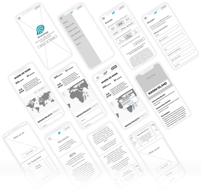
Problem 1: Navigation is too cluttered, with too many links.
Solution: Drop unnecessary search, move some links to the footer, remove secondary sub-navigation, consolidate similar pages (“who we are” and “why islands” have similar themes).
Problem 2: Homepage not informative/useful enough: user wanted a more immediate sense of what Seacology does.
Solution: Add call to action on homepage hero image. Add impact statements/diagrams. Add links to project pages.
Problem 3: Two donation paths (“Donate” vs. “Save an Acre”) are confusing
Solution: Merge these flows into one page under “Donate".
Problem 4: “Where we work” category name is confusing and ambiguous. User didn't know where to look for projects.
Solution: Change name to “What we do”, and add a shortcut to projects from “Who we are” page, as these pages are often accessed with the same intention of gathering information about the organization.
Style Guide & UI
The Goal: Preserve Seacology’s heritage by incorporating elements from the original website, such as the powerful photography and brand colors, while at the same time incorporating clean simplified elements to modernize the brand.
The color palette was directly influenced by the existing turquoise brand color and the ocean's blue and green hues. The two typefaces were chosen to evoke a friendly and current yet traditional feel. We wanted to convey a warm, sincere and optimistic identity characterized by vibrant photography, a welcoming tone, and touching stories to appeal to the user’s heart and move them to get involved.

High-Fidelity Prototype
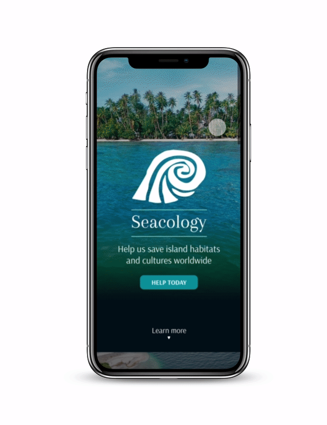
Homepage
Our redesigned homepage incorporated the solutions that were informed by all of our user research and testing. We included a prominent call to action button for donations to draw in the user's eye, as this is the main business goal of almost any non-profit . We clearly outlined their mission and included bold statistics to show the organization's impact. We incorporated previews with shortcut links to projects and current campaigns. All of these elements orient the user and give them an immediate sense of the purpose and reliability of the organization, negating the need to exert effort and time into searching for this information.
Who We Are
To establish legitimacy and trust, it was imperative that we build out a clear and easily navigable 'Who We Are' section of the redesign. From our research we found that users value this information and want it to be easily accessible when making a decision to support an organization. Properly organizing this information for the user to cut down on information overload greatly impacts the user experience. It was also important to make sure we really focused on storytelling in this section, so we repurposed powerful imagery and text in order to highlight the organization's point of view and impact.

Donate
Regarding the donation flow, our key principles were to keep it straightforward, easy and financially secure. This would encourage more donations and mitigate the feeling of uncertainty users might experience when faced with a long, daunting donation form. We didn't want the user to overthink - well we actually didn't want them to think at all. In order to execute this, we split the donation form into 2 parts to make it less monotonous, and added suggested amounts to nudge the user to donate, and to make the process feel effortless. We also integrated an option to donate to Seacology's current campaign – Save an Acre. This gives users a clear sense of connection to exactly where their donation is going and the impact their contribution will have.

What We Do
Seacology currently has over 300 projects in 61 countries, making it imperative to organize this data to become more discoverable and easily interpretable to users. In order to convey this vast amount of information without cognitively overloading the user, we decided to showcase the projects through an interactive map along with a search drop down, allowing the user to either look for a specific project or just explore Seacology's impact. Users can zoom in and out of the map to explore various regions, as well as click on specific projects to see a pop up of high level information, with an option to view more detailed information. By leading the user through a funnel, starting broad and drilling down into more detailed information, we reduce overwhelming the user. But we still made it easy for them to access information and find projects in a more intuitive manner, while providing a more engaging experience.

Responsive Design
While we built our redesign mobile first, we know from our research that our user base consisted of an older demographic that is more comfortable with a desktop view. A major issue with the current Seacology website was its lack of responsiveness to devices of different sizes. We did translate our mobile designs into a desktop prototype that adequately utilized the expanded screen real estate while maintaining our guiding principles of simplicity, scannability, and ease of navigation.

Final Takeaways
Main Challenge & Lesson Learned
For this project I felt that our team meshed very well. We each had strengths that were highlighted throughout this process. With my strength lying in visual design, I took the lead when it came to the style guide and UI elements. I also was the one who pitched this non-profit to the team and conducted the stakeholder interviews. We were also able to stay on schedule by 'dividing and conquering’ the work while ensuring cohesion in our final project. I learned that active communication with the group and employing project management tools like Trello were key to ensuring the project's success.
Next Steps
In order to continue to encourage donations, our next step would be to add alternate payment methods to the donation flow, including Paypal, Apple Pay and Google Pay. This will further facilitate the donation process and make it as effortless as possible. By continuing to make iterations that allow the user to make educated, quick and secure choices, we can increase the number of donations that Seacology receives.